From very naive approximations of the spectrum to more complex examples:
from scipy import fft
import numpy as np
import matplotlib.pyplot as plt

%matplotlib inline
Two basic ploting functions that repeat the actuall spectral analysis:
import sys
sys.path.append('../scripts')
from signal_processing import *
More elaborate example, demonstration of a leakage effect:
# We sample a signal at fs = 200 Hz and record 256 points"

# true values
A = 1.0 # Volt, amplitude
ff = 10.0 # Hz, signal frequency, zero harmonics


# We will work with different sampling frequencies
# and different lengths of records:

fs = 200.0 #Hz
N = 256 # points

plotSignal(A,ff,fs,N)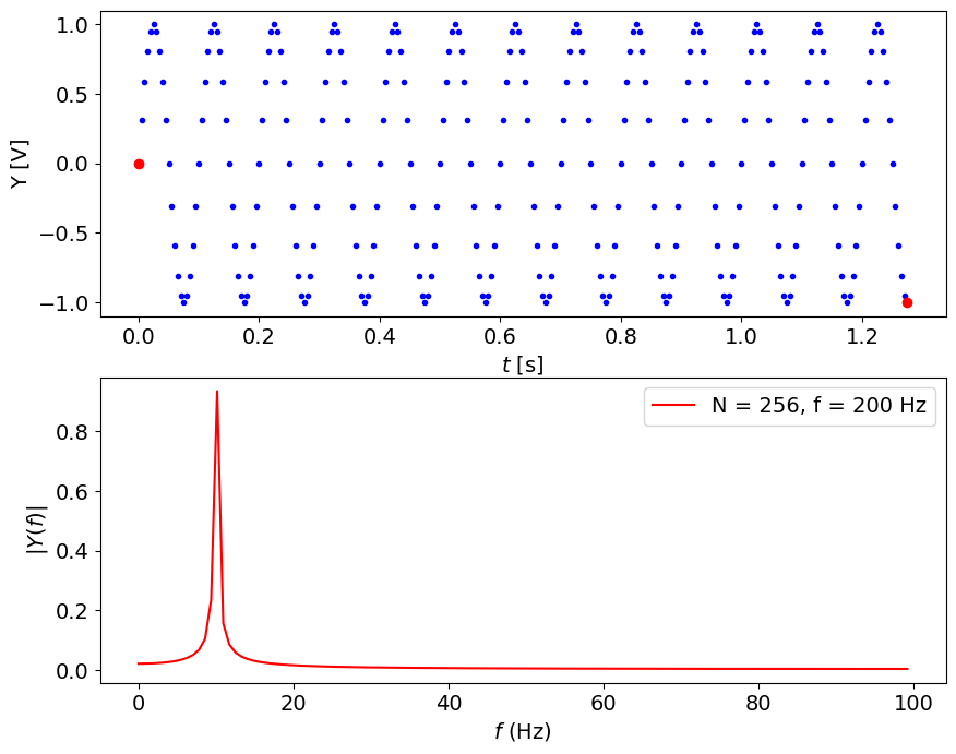
Note:
leakage at around 10 Hz
peak is below 1 Volt
we can get the spectrum up to half of sampling frequency
frequency resolution is Hz
Let us try to minimize the leakage:
Let’s first increase the sampling rate, stay with N = 256
fs = 1000.0 #Hz
N = 512 # points
plotSignal(A,ff,fs,N)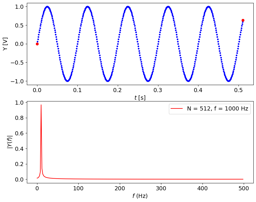
Note:
resolution in time is great BUT:
resolution in frequency is worse, Hz
we see up to 500 Hz, but have here only 128 useful points
leakage is severe, the peak amplitude is about 0.66 Volt
peak location is now 11.7 Hz
MORE IS NOT NECESSARILY BETTER
###Let us try to minimize the leakage problem sampling closer to the Nyquist frequency
fs = 25.0 #Hz
N = 256 # points
plotSignal(A,ff,fs,N)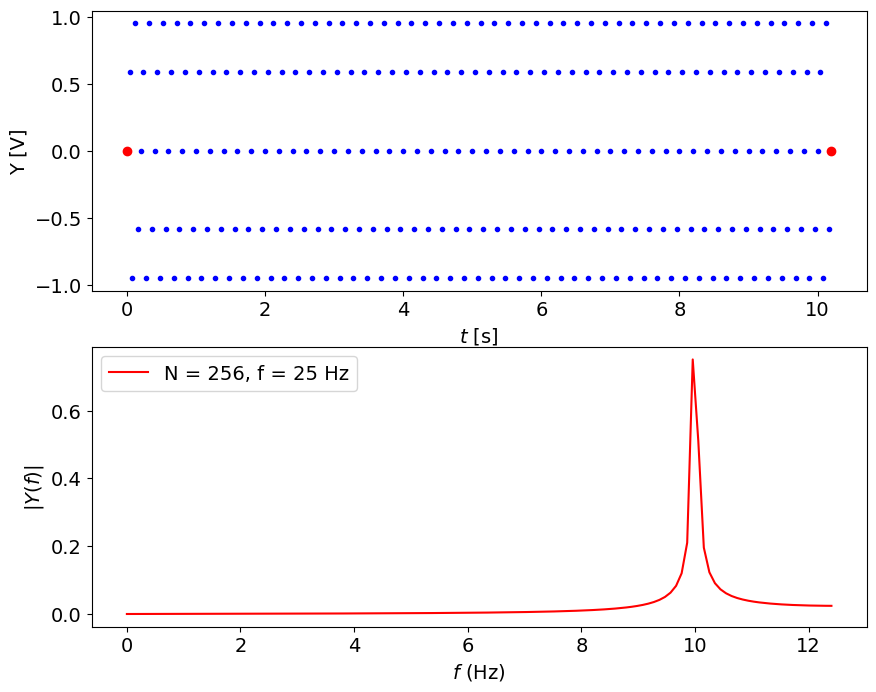
Note:
sine does not seem to be a sine wave, time resolution is bad for Nyquist frequency
frequency resolution is better, about 0.1 Hz
peak is about 0.75 Volt, less leakage but still strong
peak location is close, 9.96 Hz
Let’s get more points, keep same sampling frequency
fs = 25.0 #Hz
N = 512 # points
plotSignal(A,ff,fs,N)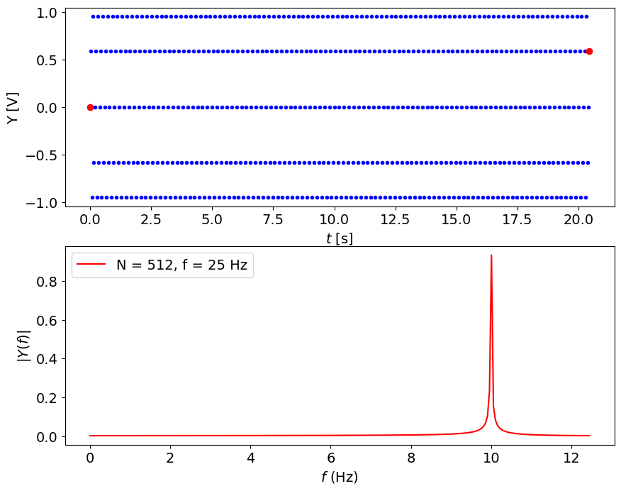
Note:
time sampling is much longer, s
peak is narrow, at 10.01 Hz
resolution is good, much lower leakage, value is close to 0.9 Volt
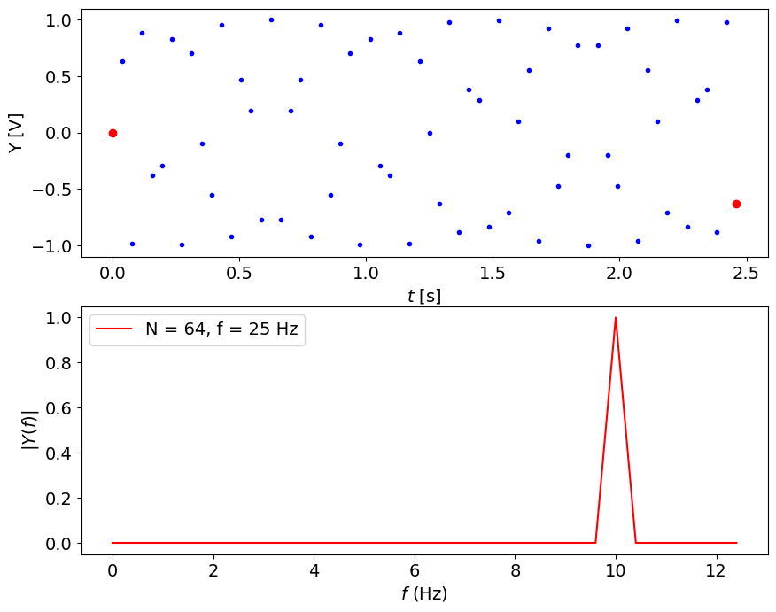
Still, how to get the perfect spectrum? Use tricks, for instance, sample at a specific frequency:
fs = 25.6 #Hz
N = 256 # points
plotSignal(A,ff,fs,N)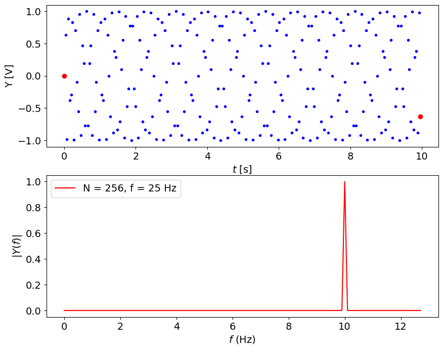
# After you know the real value, you can save a lot of time:
fs = 25.6 #Hz
N = 64 # points
plotSignal(A,ff,fs,N)